Over the last 10 years, defining features of branding has led to Social Media allowing anyone to launch into an immediate subjective/objective personal critique. Or more accurately, often, an unrelenting quagmire of abuse.
We’ve seen many of the most controversial rebrands of recent years had to saddle up brasen faced to weather the storm of hatred long before they were actually rolled out – and in some cases, as the public had their say were never actually rolled out.
AdBrand in our early years would design a brand which our customers simply ‘didn’t get’ which led to a few hiccups, however once our clients were explained the full branding scheme and the rationale behind them rather than just the logo in stark isolation, hate turns to love. Sometimes, those initially hated rebrands turn out to become the world’s best logos.
This article will teach us about branding and the reported PR disasters surrounding them. Here are just some of the most hated logos of all time…
01. London 2012
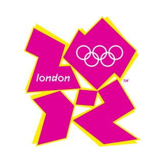
As you may recall, Wolff Olins’ bold, mould-breaking brand for London 2012 attracted plenty of flak. Criticisms ranged from simple legibility concerns, to more outlandish claims that Lisa Simpson appeared to be engaging in fellatio (look at this from an angle and use creative license).
It got political when Iran’s Olympic team insisted it spelled out ‘Zion’, and someone else spotted a swastika. Matters worsened further when the bright, flashing colours from the promo film induced epileptic fits.
Once the Olympics kicked off in earnest, and the brand was seen in context across a dizzying array of applications, attention shifted to the glorious summer of sport in the UK capital. Away from the usual offering of a bland, identikit, safe Olympics logos, most people around the world could still pick it out of a line-up instantly. What do you think?
The lesson here? Breaking new ground and doing something daring with a brand will get you noticed. Not always for the right reasons, but sometimes it’s better to be brave and different – and hated by some – than to fade into oblivion. That’s how innovation happens.
02. Gap (briefly)
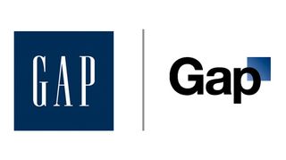
Gap’s disastrous attempt to embrace the beige, minimalist, Helvetica-vanilla revolution blew up so comprehensively in its face that the whole attempt was canned after less than a week.
In place of its iconic blue square with tall, condensed serif type, the US clothing giant attempted to launch something so half-hearted and limp, the internet descended into a maelstrom of mockery and snide imitation. We think it portrays the basic visuals of an online accountancy software.
What’s to be learned from this branding burp? Firstly, don’t ever throw away brand heritage to try and embrace a new trend – but perhaps most importantly, know when you’ve got it wrong, and concede defeat (and thank you for having replacing your creative ego with humility).
03. USA Today
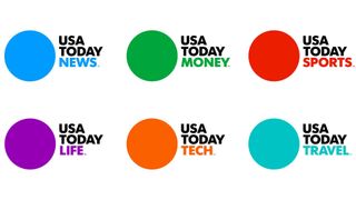
Wolff Olins met with controversy once again with its 2012 rebrand of USA Today – a title that, since its launch in the 1980s, has grown into one of the widest-circulated newspapers in the States, alongside the substantially older Wall Street Journal and New York Times.
The backbone of the rebrand was a simple visual system, based around a large, flat-colour blue circle – an ultra-minimalist rendition of the previous globe graphic – and stacked Futura all-caps text. Unfortunately, at first glance it was far too simple for some, attracting a tirade of abuse accusing it of being simplistic, off-brand and even insulting to readers’ intelligence.
The branding solution was more than met the eye, however. As well as being pared-back, clean and simple, it was also incredibly versatile – the circle acting as a container device for content, and the colour scheme signifying different sections of the paper. We feel is works very effectively.
The take home? When there’s a more complex identity system that needs to be seen in context, ignore that initial wave of criticism and launch with confidence.
04. Tropicana (briefly)
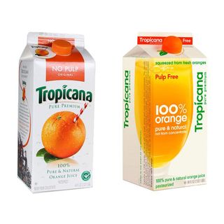
Like Gap, this is another short-lived rebrand that ultimately buckled under overwhelmingly negative attention. When juice brand Tropicana ditched its instantly recognisable ‘straw stuck in an orange’ motif and replaced it with a generic crop of a glass of orange juice, people simply weren’t having it and as a consumer brand it needs it’s customers to relate and engage (read more on The Psychology behind packaging design)
Customer complaints reached sufficient volume that the brand’s owner, PepsiCo, threw in the towel and reverted to the original branding within a couple of months.
The lesson here is a no-brainer: if you have something distinctive and well-loved about your brand that gives it shelf-standout in a competitive FMCG sector, don’t frivously discard in a misguided attempt to look ‘contemporary’.
05. BP
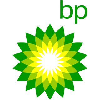
This is the oldest example on this list, from the year 2000 – in many ways a precursor of the public furore around high-profile rebrands that would come to define this millennium so far. It was an unmitigated PR disaster.
In a move widely derided at the time as an attempt to ‘greenwash’ its reputation, oil giant British Petroleum brought Landor on board to replace its imperialist green-and-yellow shield with a delicate geometric flower. The chunky all-caps ‘BP’ become lowercase, hovering above the flower, with a new slogan: ‘Beyond Petroleum’.
Given that the rebrand and its subsequent global rollout cost tens of millions of dollars, environmentalists were quick to point out BP had spent far more on its new logo than on investing in renewable energy sources. Subversive designers turned the logo into a meme, complete with stricken turtles and oil-drenched seabirds.
What is the lesson here? Many companies have learned the hard way over the years, is that you can’t paper over the cracks with branding and expect people to change their opinions – authenticity is everything, and an ideological rebrand such as this needs organisational change to back it up.
06. Airbnb
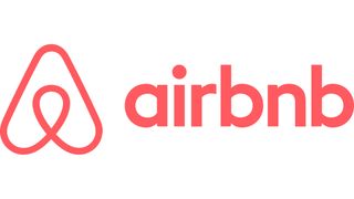
DesignStudio’s rebrand of Airbnb launched the agency into the global spotlight back in 2014, and was the first in a string of controversy-attracting projects that included Premier League and Deliveroo.
The Airbnb ‘Bélo’ was described on launch as “an expression of what it truly means to belong anywhere”, accumulating a hug, a map and a heart. These figured fairly low on the list of things the public compared the symbol with, however.
Entire Tumblrs were devoted to the Bélo’s resemblance to various parts of the human anatomy (mostly genitalia). Others insisted it evoked the chin of Family Guy’s Peter Griffin, amongst other things.
DesignStudio calmly weathered the storm of hilarity and indignation, and the Bélo is now comfortably bedded in as a contemporary icon.
If you and the client stand by the thinking behind a rebrand, don’t let social media trolls get to you. Unlike Gap or Tropicana, we believe one definitely improves with age.
07. American Airlines
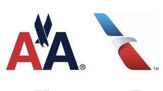
When you have an effortlessly iconic logo designed by a master such as Massimo Vignelli, you’d think it would be a tough decision to ditch it. That’s exactly what American Airlines did, and people got mad.
Vignelli’s bold, graphic cross-winged eagle symbol, neatly sandwiched between the twin ‘A’s, had a pleasing visual symmetry that felt both timeless and elegant. Its replacement is none of those things, watering the confident navy down to a softer blue and reducing the majestic eagle in flight to an abstract beak.
The lesson? If it ain’t broke, don’t fix it. And if you have a Vignelli classic under your belt, it definitely ain’t broke.
08. IHOP
The International House of Pancakes, otherwise known as IHOP, is something of an American institution. But few things are more likely to put you off enjoying your fluffy, syrupy breakfast fare than the fixed gaze of a demonic clown.
Perhaps in an attempt to emulate the warm ‘smile’ motif that Turner Duckworth achieved so effectively for Amazon, IHOP capitalises on the face-like juxtaposition of the ‘o’ and the ‘p’ in its name. But while the combination of chunky, blue rimmed, staring eyes and thin red grin exudes many things, warmth isn’t among them.
The lesson? If you’re trying to make a logo look friendly and approachable, test it on actual humans and see if they bolt in terror. That’ll be a good clue.
09. Instagram
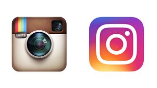
One of the biggest milestones in the death of skeuomorphism, and the rise of flat design, was when Instagram dropped its retro, textured camera in favour of a pared-back icon, adorned with a neon rainbow gradient. The internet freaked out.
Like many of the other examples on this list, this was a rebrand that launched a thousand memes. Panned for looking like something that had crawled out of Microsoft Paint in the ’90s, this radical new direction for Instagram’s logo spawned plenty of rip-offs and snide ‘logo generators’.
Some lamented the fact that Instagram’s ‘retro camera’ essence – the whole founding principle of the app – had been lost, while others simply hated the zingy, garish colour palette. But as flat design became the defining look and feel of iOS, the ‘native’ feel of the app icon has acted in its favour.
Where it was once known primarily for its retro photography filters – for which the skeuomorphic camera was a neat fit – Instagram is now one of the foremost social media platforms.
Sometimes, initially unpopular design decisions have broader strategic reasons at their heart.
What is the take home from this?
Understanding: Be clear on your reasoning behind the face-lift. Dare to be different but ensure your heritage and values remain in tact.
Rationale: Ensure the design agency is clear on the brief, and provides ‘rationale through research’ to ensure your customers love the rebrand, even if you’ll take time for it to grow on you.
Concept: Offer your agency the time to present their ideas, with an open-mind. They may have just racked DiVinci’s code to your future.
Rollout: Think differently about the application, investing in different innovative ways to launch your brand will also help you get noticed. You agency should have ideas about the routes available. Consider video!!
You can read more about the process of rebranding here.and say hello@adbrand.tv
Thank you for reading.
Adam Ridgway
Creative Director
AdBrand


